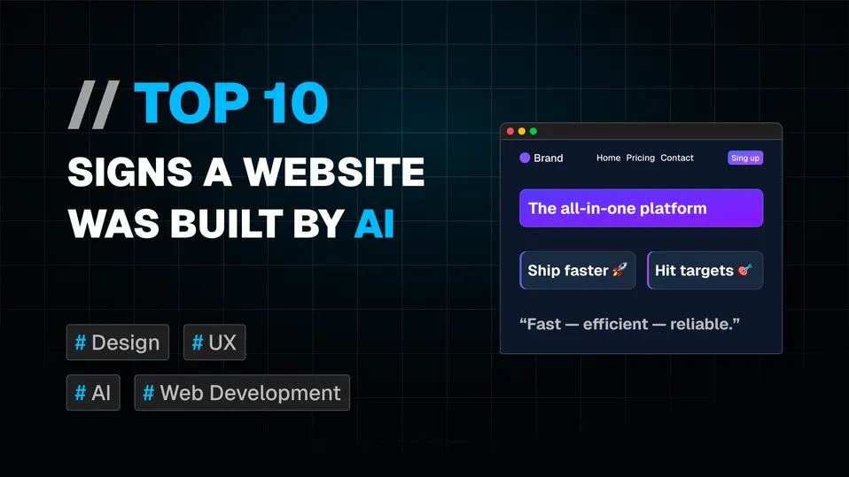
Having spent years building, designing, and optimizing web applications, I’ve developed an eye for the subtle choices that make an interface feel human. But over the past couple of years, the web has been flooded with a new species of sites: layouts generated entirely by Large Language Models and AI web builders.
AI design tools have come a long way, but LLMs are essentially hyper-advanced pattern matchers. They default to the absolute safest average of their training data. As a result, AI-generated websites share a distinct set of visual and structural fingerprints.
If you know what to look for, you can spot them in under five seconds. Here are my top 10 visual red flags that tell me a website was generated by AI rather than crafted by a human developer.
1. The Ubiquitous Em Dash (—)
The dead giveaway often isn’t in the CSS; it’s in the copy. LLMs love the em dash.
While professional human writers certainly use em dashes for emphasis, AI models overuse them to an almost comical degree. You will see them sprinkled across hero headlines, feature summaries, and call-to-action cards:
Build faster — without sacrificing quality — using our next-gen platform.
One or two is just natural writing. Four in a hundred words, next to a headline like “Ship faster — without the guesswork” is an instant tell. When an LLM generates UI copy and layout in one pass, long hyphens are its favorite bridge to connect fragmented ideas without having to structure proper, varied sentences.
2. The Default “indigo-to-violet” Color Palette
Ask an AI tool for a modern, tech-focused landing page and, statistically, you’ll get some variation of the exact same color palette pulled straight from default Tailwind CSS variables:
| Role | Typical value |
|---|---|
| Primary | #615fff (Indigo 500) |
| Secondary | #8e51ff (Violet 500) |
| Background | #0f172b (Slate 900) |
| Hero gradient | #4f39f6 → #7f22fe |
This combination is everywhere because it looks polished, passes contrast checks, and requires no color theory knowledge to produce. It is what you get when you skip the step of building a color palette and go straight to generating a UI.
Ship Smarter.
Tailwind popularized indigo-500 and slate-900 as extremely attractive defaults in its documentation and component kits years before the LLM boom. As a result, this exact palette was baked into an enormous share of open-source repositories and component libraries used to train LLMs. Now, it is the hardcoded reflex every AI tool reaches for the moment a prompt omits specific brand tokens. It isn’t a deliberate design decision; it’s a statistical average wearing Tailwind class names.
3. The Left-Border Gradient Card
A thin, colored accent running down the left edge of a container has become one of the most specific visual tells in AI-generated interfaces. It shows up on feature grids, metrics dashboards, and pricing callouts — anywhere an AI needs to make a box of text feel “designed” without committing to a real layout decision:
4. Emojis Where You Would Expect Icons
The rocket emoji 🚀 for “lightning performance.” The lightbulb 💡 for “smart features.” The sparkles ✨ wherever something needs to sound premium or AI-powered.
Icons are surprisingly annoying to set up correctly. You need to choose a library (Lucide, Heroicons, Phosphor, Tabler), install it, learn the import syntax, and build a consistent wrapper. AI-generated sites often skip all of this and use emoji instead:
🚀 Ship faster
✅ Built-in quality checks
🎯 Hit your targets
The emoji read fine in isolation. The problems are mechanical. Emoji rendering differs across operating systems and they do not inherit CSS color values, which means they cannot adapt to theme changes, dark mode, or hover states. They also do not scale cleanly at larger sizes.
A feature section built with emoji as functional icons has almost certainly never been through a design review. It is the fastest path from “generate this page” to “ship it,” which is exactly why it appears so often.
5. Testimonials With Suspiciously Generic Names
Nothing reveals an AI faster than its attempt at fake social proof:
Names are where AI models really fall apart. Instead of inventing distinctive identities, models regress to the statistically most common name combinations in training data:
- John Smith
- Sarah Johnson
- Michael Brown
- Alex Miller
Paired with generic titles (“Verified User”, “Product Lead”), stock avatar placeholders, and overly formal marketing phrasing, these reviews lack the flawed, highly specific details found in real customer feedback.
6. Very Few Real Images
Sourcing, editing, and placing real photography in a web design takes time and judgment. You need to think about aspect ratios, focal points, compression, and art direction. AI-generated sites consistently avoid this work in one of two ways.
Option A: Use no images at all, replacing them with gradient backgrounds, abstract geometric shapes, or looping Lottie animations.
Option B: Use obviously AI-generated imagery. This usually means hyperrealistic stock people with impossibly flawless skin, unnervingly symmetrical features, and glassy, artificial eyes, all placed in sterile environments that feel assembled from separate photos
Both approaches avoid the question of what the actual product, team, or customer looks like. That absence of specificity is itself a signal. Real companies have real offices, real team photos, and real product screenshots. When a site shows you nothing concrete, it is often because there was nothing concrete to show when the prompt was written.
7. Typographic “Smart Quotes”
Look closely at the quotation marks. Standard keyboards only feature straight quotes (" and '), which means true typographic curly quotes (“ and ’) require manual keyboard shortcuts that almost no one takes the time to use. AI models, on the other hand, frequently output formatted curly quotes directly into their generated text. When a website is filled with slick, perfectly curved quotes instead of the standard straight keys from a human keyboard, it raises a subtle red flag. It is a suspicious clue that the copy might not have been typed out by a person in an editor, but pasted straight from an AI prompt.
8. Rigid Symmetry and Uniform Card Lengths
AI defaults to perfectly even layouts: three feature cards, a 2×2 grid, or steps numbered 01, 02, 03. Every card gets the exact same layout math, with zero asymmetrical breaks.
Look closer at the text inside those cards and the pattern continues. Every description contains two sentences, and every subhead hits roughly fifteen words. AI fills rigid templates sequentially, padding or trimming copy to keep column lengths identical.
Human design adapts to natural variations in content length. When every card across an entire site is mathematically identical down to the word count, the layout feels mechanical and artificial.
9. Responsive by Default, Empty by Design
AI-generated sites tend to use a lot of whitespace. Not the deliberate kind, used to draw attention or create breathing room around important content, but the kind that exists because generating a responsive layout is easier when every section has py-24 and almost nothing competes for space.
On mobile, this looks acceptable. On a 27-inch monitor, it looks like the designer ran out of content and kept the padding anyway.
The underlying reason is mechanical. AI tools optimize for code that works at every breakpoint without requiring complex layout decisions. Generous spacing prevents elements from overlapping at unexpected widths, and fewer UI elements mean fewer things to make responsive. The result is a site that passes RWD testing but feels half-finished at scale, with generous whitespace standing in for genuine design decisions.
10. The “Soulless” Visual Vacuum
Ask anyone to review an AI-designed site and they will eventually reach for the same word: soulless.
It’s rarely one single flaw. It’s the cumulative weight of several tells landing on the same page, combined with a total absence of intent behind any individual choice. Human design contains context, deliberate friction, opinionated spacing, subtle quirks, and micro-interactions that reflect a brand’s personality.
When an AI averages millions of existing websites into a single layout, it eliminates all anomalies. In doing so, it eliminates character. The page ends up technically correct, perfectly balanced, and instantly forgettable.
Why This Matters
These patterns matter because they are flattening the web into a single, predictable aesthetic. When every SaaS landing page shares the exact same visual language, design stops being a differentiator and becomes visual static. Every item on this list is simply a default fallback that fires when a prompt lacks direction.
The good news is that these signals are easy to fix. Pick a custom color palette before generating anything. Source one real photo of your product or team. Write testimonials with authentic names and concrete results. Swap emoji for a proper icon system, and deliberately break a layout rule or two to give the page character.
AI can build your layout in seconds, but only human intentionality can make it worth remembering.
