Visual Studio Code Dark 2026: The New Design Standard
I updated VS Code one morning, opened a TypeScript file, and immediately felt like something was wrong. Not broken — just unfamiliar in a way I couldn’t pinpoint for the first thirty seconds. The yellow #dcdcaa function calls were gone, and keywords were different colors. My eyes kept hunting for anchors that had quietly moved.
This is what a default theme change feels like in an editor you’ve used for years. It’s not about the colors looking bad; it’s that your brain has years of shortcuts wired to specific hues, and those shortcuts stopped firing. When the visual vocabulary shifts overnight, your productivity takes a temporary but measurable hit.
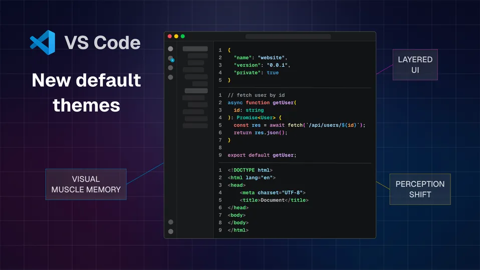
VS Code 1.113 (March 25, 2026) ships Dark 2026 as the new default, replacing Dark Modern. Microsoft’s stated goal, tracked in GitHub issue 293405, was one word: Focus. They aimed for a reduced palette, strategic accents, and a properly layered UI hierarchy. Whether the execution delivers on these goals depends heavily on what language you live in, and as of today, that issue is still open.
How to Change the VS Code Theme (or Revert)
If you’re looking for how to change the theme in VS Code or switch back from Dark 2026, you can do it instantly with the theme picker:
- macOS: Cmd + K → Cmd + T
- Windows/Linux: Ctrl + K → Ctrl + T
This shortcut opens the VS Code color theme selector.
Type:
- “Dark 2026” → new default theme
- “Dark Modern” → previous version
- “Dark+” → classic experience
Nothing has been removed — all three themes still ship with VS Code, so you can switch themes anytime.
Why This Hits Harder Than a Normal Update
When you scan code, you’re not reading characters — you recognize patterns. Color is processed pre-attentively, before conscious thought engages. After thousands of hours in one theme, these shortcuts become automatic:
- Purple #c586c0 → flow-control keywords:
if,return,export - Blue #569cd6 → structural keywords:
const,class,using - Yellow #dcdcaa → function callsites
- Teal #4ec9b0 → types and interfaces
- One color for
<div>, a different one for<Button>
Dark 2026 moves all of these. The community reaction reflects the real cost of having a decade of perceptual shortcuts invalidated at once. One GitHub issue 305526 describes it as “a silent, unsolicited modification” that broke syntax highlighting without warning or a migration guide. This resistance isn’t just about aesthetics; it’s about the neurological friction of relearning how to read your own code.
The Tokens: What Changed and What the Numbers Say
All contrast ratios are calculated using WCAG relative luminance against each theme’s editor background. AA requires 4.5:1, AAA requires 7:1.
1. Background — Stronger Hierarchy
| Theme | Editor | Sidebar | Separation |
|---|---|---|---|
| Dark+ | #1e1e1e | #252526 | 1.09:1 |
| Dark Modern | #1f1f1f | #181818 | 1.08:1 |
| Dark 2026 | #121314 | #191A1B | 1.07:1 |
The editor #121314 is now the darkest surface again, restoring a proper visual hierarchy and boosting contrast across all tokens. This makes the canvas feel more like a focused workspace while the sidebar correctly recedes into the background.
2. Strings — Light Blue, But Now Colliding With Variables
This is one of the more noticeable changes in the update. In Dark Modern, strings used a warm orange-brown #ce9178 — a color I was never particularly attached to, even if I got used to it over time. Dark 2026 replaces it with a light blue #a5d6ff.
| Token | Theme | Color | Ratio | WCAG |
|---|---|---|---|---|
| Strings | Dark Modern | #ce9178 (brown) | 6.31 | AA |
| Strings | Dark 2026 | #a5d6ff (light blue) | 12.10 | AAA |
While the contrast improvement is substantial, reaching AAA levels, the trade-off is semantic separation. Variables and identifiers also live in the blue spectrum, reducing the hue distance that previously made string literals instantly recognizable during a fast scan.
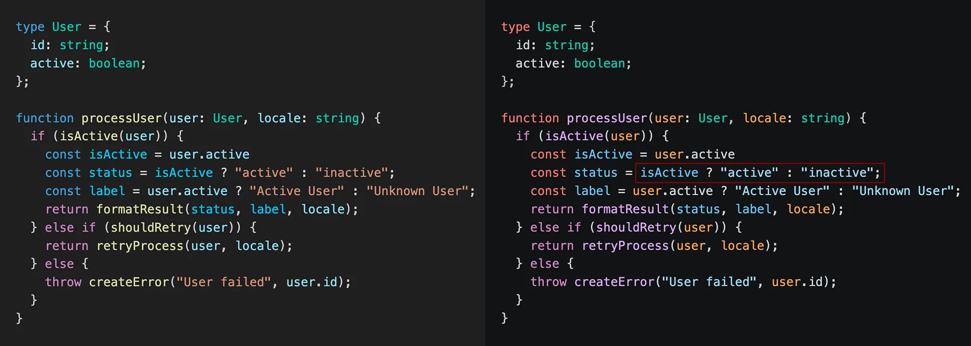
3. Parameters — Orange and Finally Meaningful
Another change I won’t revert from is the shift for parameters. Dark Modern parameters were light blue #9cdcfe, indistinguishable from local variables or imports without hovering. Dark 2026 shifts them to a warm orange #ffa657, providing much-needed clarity.
| Token | Theme | Color | Ratio | WCAG |
|---|---|---|---|---|
| Parameters | Dark Modern | #9cdcfe (light blue) | 11.18 | AAA |
| Parameters | Dark 2026 | #ffa657 (orange) | 9.61 | AAA |
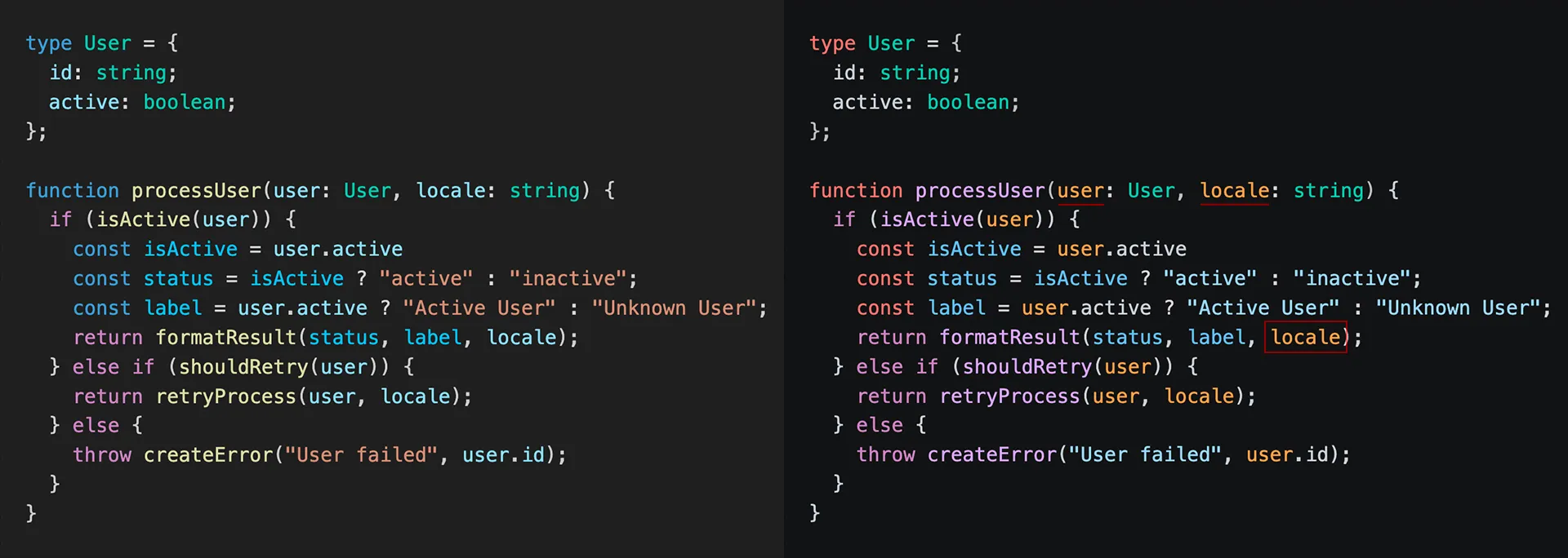
The raw ratio dropped, but the semantic gain is larger. Orange sits across the hue wheel from purple keywords and light blue strings. When reading an unfamiliar function, the orange identifiers immediately tell you where the data enters without needing to trace back to the signature.
Where It Goes Wrong
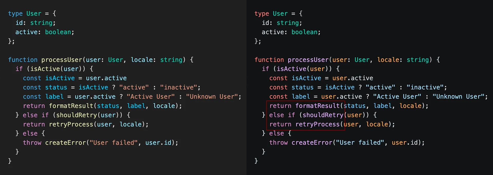
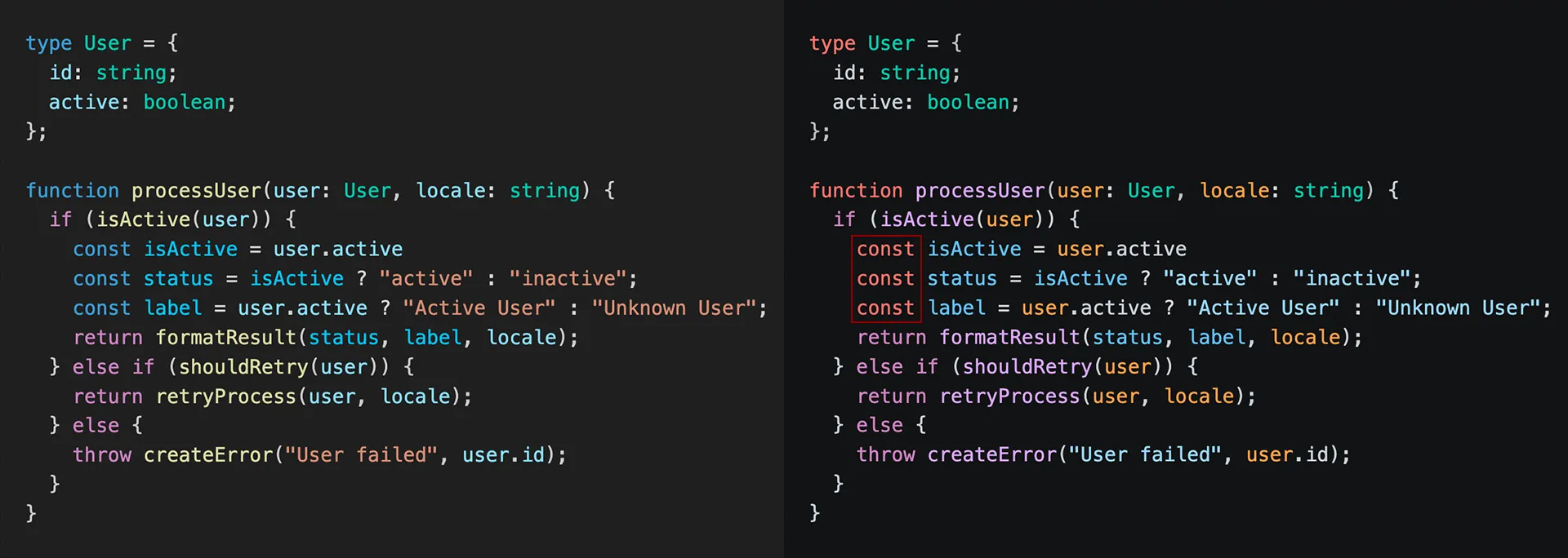
4. Functions and Flow-Control Keywords: Purple on Purple
A key regression affecting code readability is the reduced separation between flow-control keywords and function calls. In Dark Modern, flow keywords were purple #c586c0, while function callsites stood out in yellow #dcdcaa at 11.80:1 AAA.
Dark 2026 keeps flow keywords purple #c586c0 but moves function names to a near-identical purple shade #d2a8ff. While they are technically different hex values, the hue distance is too small to rely on at scan speed. Replacing a distinct, high-contrast yellow with a purple that collides with control flow is a clear regression in usability.
| Token | Theme | Color | Ratio | WCAG |
|---|---|---|---|---|
| Functions | Dark Modern | #dcdcaa yellow | 11.80 | AAA |
| Flow keywords | Dark 2026 | #c586c0 purple | 6.68 | AA |
| Functions | Dark 2026 | #d2a8ff similar purple | 9.55 | AA |
5. Structural Keywords — Blue → Red
Structural tokens like function and namespace also saw a major shift. The contrast slightly improves, but IMHO the move to #ff7b72 (red) introduces unintended “error-like” semantics. Seeing structural keywords in red triggers a false alarm in the developer’s mind, as red is almost universally reserved for problems.
| Token | Theme | Color | Ratio | WCAG |
|---|---|---|---|---|
| Structural | Dark Modern | #569cd6 (blue) | 5.65 | AA |
| Structural | Dark 2026 | #ff7b72 (red) | 7.38 | AAA |
6. HTML Attributes — The “No Contrast” Zone
Another subtle but frustrating regression appears in standard HTML files. Attributes and their values have lost their hue distance. Attributes are now rendered in #9cdcfe (light blue), while their values use #a5d6ff (the new string color). To the human eye, the distinction is almost invisible. It turns a structured tag into a monolithic block of light blue text, making it harder to spot specific attributes during a quick scroll.
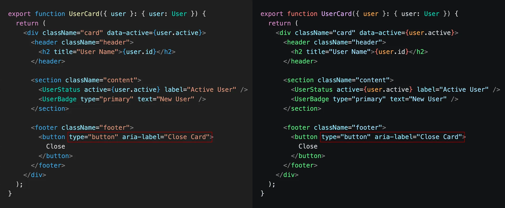
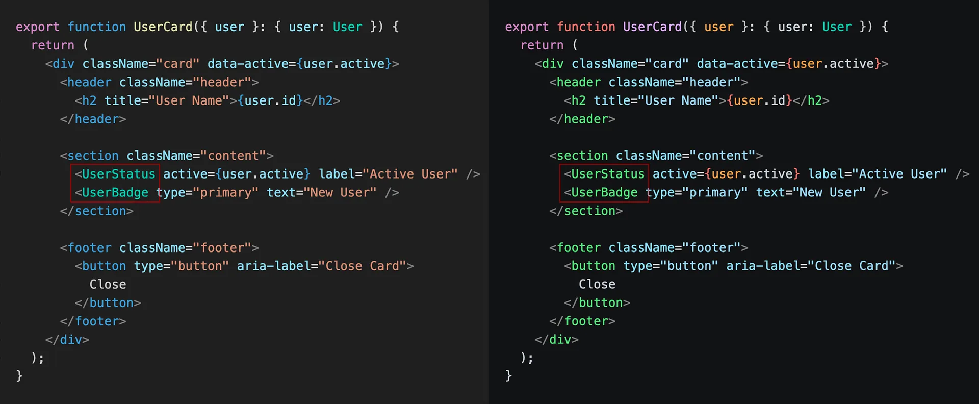
7. JSX and Astro — Lost Distinction
Frontend developers will feel the loss of distinction in JSX and Astro files. Before, HTML tags were blue #569cd6 and components were teal #4ec9b0. Now, both have collapsed into the same green spectrum #7ee787. This makes scanning large templates significantly harder, as you can no longer distinguish native tags from custom components at a glance.
8. Search Highlight — Worse Visibility
Search highlights also went backward in terms of usability. The contrast ratio dropped from 3.56 (#9F6A03) to 1.96 (#284A59), remaining well below WCAG standards. The ratio between the current find (#284A59) and other finds (#1D3E4B) is almost unnoticeable, making it difficult to distinguish the active match during a search.
Full Contrast Table
| Token | Dark Modern | Dark 2026 | Δ | |
|---|---|---|---|---|
| Comments | 4.95 AA | 6.05 AA | +1.10 | 🟢 |
| Types | 8.09 AAA | 9.13 AAA | +1.04 | 🟢 |
| Variable names | 11.05 AAA (blue) | 12.05 AAA (white) | +1.00 | 🟢 |
| Flow keywords | 5.92 AA | 6.68 AA | +0.76 | 🟢 |
| Parameters | 11.18 AAA (blue) | 9.61 AAA (orange) | −1.57 | 🟢 worse ratio, but better semantics |
| Strings | 6.31 AA (brown) | 12.10 AAA (blue) | +5.79 | 🟡 good, but not instantly recognizable |
| Structural keywords | 5.92 AA (blue) | 7.38 AAA (red) | +1.46 | 🟡 jarring |
| Search highlight | 3.56 FAIL | 1.96 FAIL | −1.60 | 🔴 worse + difficult to distinguish |
| Functions | 11.66 AAA (yellow) | 9.55 AA (purple) | −2.11 | 🔴 regression + collision |
| HTML attr vs attr value | distinct | almost same blue | — | 🔴 signal lost |
| JSX tag vs component | distinct | same green | — | 🔴 signal lost |
It Looks More Like Monokai × Tokyo Night Than VS Code
This might be the sharpest observation: Dark 2026 doesn’t feel like VS Code anymore. Dark+ and Dark Modern had a recognizable identity — cool blue-grey, the purple/blue/teal vocabulary, that measured Microsoft restraint. Dark 2026, with its near-black canvas, light blue strings, warm orange parameters, and greenish tags, feels closer to a blend of Monokai and Tokyo Night. Neither of those is a bad theme, but VS Code has quietly lost the visual signature it spent a decade building. Many developers noticed it immediately and have already reverted to Dark Modern.
Verdict
The foundation of Dark 2026 is strong, offering a better hierarchy, improved contrast in key areas, and a meaningful parameter color that aids readability. However, several choices introduce unnecessary friction: the function/keyword collision (purple #d2a8ff), the jarring red #ff7b72 structural tokens, and the lost distinction in JSX templates. It feels like a work-in-progress shipped as a default, and until these pain points are addressed, many will find it hard to fully commit.
